How to Support Both PC and Mobile
# How to Support Both PC and Mobile
Due to differences in viewport sizes between PC and mobile devices, UI and UX variations exist. Therefore, when developing custom components, it's often necessary to accommodate both device types.
# Prerequisites
Before learning how to debug custom components, you should know:
- Custom components are developed based on the JavaScript ecosystem
- Custom components are developed based on the Vue ecosystem
# Compatibility Approaches
# Develop Two Separate Components for PC and Mobile
This approach is highly recommended.
PC Version
<template>
	<div>
    	This is the PC version
  	</div>
</template>
<script>
    export default {
        props: ['data']
    }
</script>
Mobile Version
<template>
	<div>
    	This is the mobile version
  	</div>
</template>
<script>
    export default {
        props: ['data']
    }
</script>
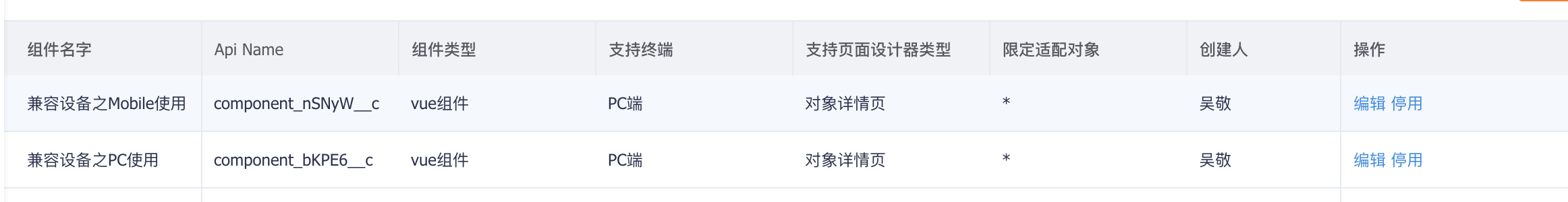
Finally, use the corresponding custom component in layouts for different platforms.
# Develop a Single Component with Runtime Adaptation
<template>
	<div :class="{'wrap-pc': isPC, 'wrap-mobile': !isPC}">
    	{{isPC ? 'This is the PC version' : 'This is the mobile version'}}
  	</div>
</template>
<script>
    var UA = typeof window !== 'undefined' && window.navigator && window.navigator.userAgent.toLowerCase()
    var isAndroid = (UA && UA.indexOf('android') > 0);
    var isIOS = (UA && /iphone|iPhone|ipad|ipod|ios/.test(UA));
    var isPC = !isAndroid && !isIOS;
    export default {
        props: ['data'],
        data() {
            return {
                isPC: isPC
            }
        }
    }
</script>
Finally, use the same custom component across different platform layouts.