Object Form
# FxObjectForm Component
Used for displaying create/edit forms of business objects.
# Attributes
| Parameter | Description | Type | Optional Values | Default Value |
|---|---|---|---|---|
| apiName | Business object API name (required) | String | — | - |
| type | Create or edit mode | String | add/edit | add |
| recordType | Business type (when not provided, automatically retrieves the object's business type. If only one exists, it will be displayed directly; if multiple exist, a dropdown will be shown for selection) | String | - | - |
| data | Form data for edit mode | Object | - | - |
| beforeParse | Hook function before form data processing | Function | - | - |
| beforeCalculate | Hook function before form data calculation | Function | - | - |
| beforeSubmit | Hook function before form submission | Function | - | - |
| beforeLayoutRule | Hook function before form layout rule processing | Function | - | - |
| submitSuccess | Hook function after successful form submission | Function | - | - |
| showTitle | Whether to display form title | Boolean | - | true |
| showButtonsOnTop | Whether to display form action buttons at the top (false displays at bottom) | Boolean | - | false |
| cancel | Callback for form cancel button | Function | - | - |
# Basic Usage
The component can be obtained via FxUI.component.get('ObjectForm').
Code example:
<template>
    <object-form apiName="AccountObj" type="add" recordType="default__c"></object-form>
</template>
<script>
    export default {
        components: {
            ObjectForm: FxUI.component.get('ObjectForm')
        }
    }
</script>
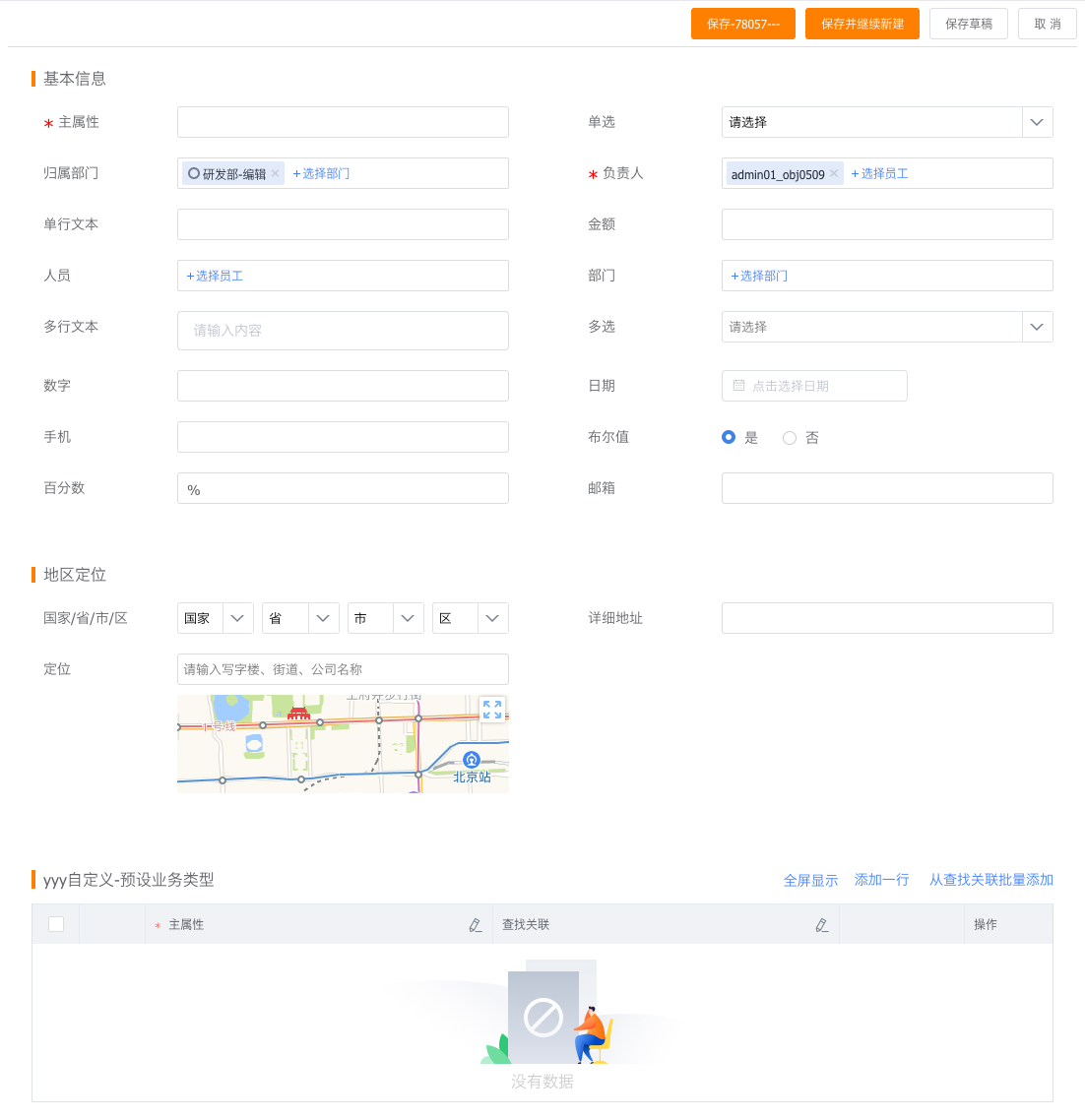
Preview:
# Advanced Usage
Basic usage may not meet enterprise-specific requirements. We provide developers with extension methods to quickly develop customized features.
# Hooks
Before submitting data to the server, the object form goes through several processes—such as form layout retrieval/parsing, layout rule retrieval/parsing, and real-time calculations. During this process, hook functions are executed, allowing developers to add custom code at different stages.
<template>
    <object-form :beforeParse="beforeParse" :beforeSubmit="beforeSubmit" apiName="AccountObj" type="add"></object-form>
</template>
<script>
    export default {
        components: {
            ObjectForm: FxUI.component.get('ObjectForm')
        },
        data() {
            return {
                beforeParse(res){
                    // todo what you want
                    return res;
                },
                beforeSubmit(data) {
                    // todo what you want
                    return data;
                }
            }
        }
    }
</script>
For detailed information about hook functions, continue reading.
# Component Slots
The component slot mechanism allows developers to replace specific components or component types with their own custom components, modifying the interaction style of fields.
<template>
    <object-form apiName="AccountObj" type="add">
        <!-- Replace all long text fields -->
        <template v-slot:long_text="slotProps">
            <cus-field-one :fieldAttr="slotProps.fieldAttr"></cus-field-one>
        </template>
        <!-- Replace field with api_name field_Hs2S3__c -->
        <template v-slot:field_Hs2S3__c="slotProps">
            <cus-field-two :fieldAttr="slotProps.fieldAttr"></cus-field-two>
        </template>
    </object-form>
</template>
<script>
    export default {
        components: {
            ObjectForm: FxUI.component.get('ObjectForm'),
            CusFieldOne: {
                render: h => h('div', 'Custom Field 1')
            },
            CusFieldTwo: {
                render: h => h('div', 'Custom Field 2')
            }
        }
    }
</script>
For detailed information about component slots, continue reading.
# Hooks
# beforeParse
Called after the form API call succeeds, before rendering. Here you can modify field descriptions, layout descriptions, layout rules, etc.
# beforeSubmit
Called when submitting data, before calling the create/edit API. Suitable for modifying submitted data.
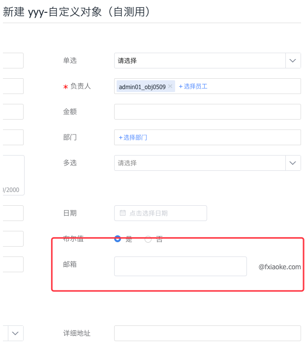
# Example:
Modify the email field to display the email suffix directly next to the input box.
// app.vue
<template>
    <object-form :apiName="data.object_api_name" type="add">
        <template v-slot:email="slotProps">
            <CustomField :apiname="slotProps.apiname" :fieldAttr="slotProps.fieldAttr"></CustomField>
        </template>
    </object-form>
</template>
<script>
import CustomField from './customField';
export default {
    props: ['data', 'userData'],
    components: {
        CustomField,
        ObjectForm: FxUI.component.get('ObjectForm')
    }
}
</script>

// customField.vue
<template>
    <div class="custom-email">
        <fx-input ref="emailInput" class="custom-email_input" v-model="dInput" placeholder="" @change="onChange"></fx-input>
        <span class="custom-email_span">@fxiaoke.com</span>
    </div>
</template>
<script>
    export default {
        props: {
            fieldAttr: {
                type: Object,
                default: function () {
                    return {}
                }
            }
        },
        data() {
            return {
                dInput: ''
            }
        },
        methods: {
            onChange () {
                const apiName = this.fieldAttr.api_name;
                let reg = /^\w+([-+.]*\w+)*$/;
                if (!reg.test(this.dInput)) {
                    this.$context.showFieldError(apiName, 'Please enter a valid email', $(this.$el));
                } else {
                    this.$context.hideFieldError(apiName);
                }
                this.$context.setData(apiName, {
                    apiname: apiName,
                    value: this.dInput + '@fxiaoke.com'
                });
            },
            getValue () {
                return this.dInput + '@fxiaoke.com';
            }
        }
    }
</script>
<style lang="less">
    .custom-email{
        display: flex;
        align-items: center;
        .custom-email_input{
            flex: 1;
        }
        .custom-email_span{
            width: 100px;
            margin-left: 10px;
            text-align: right;
        }
    }
</style>
Preview: