Developing Your First Mini Program Custom Component
# Developing Your First Mini Program Custom Component
Mini program custom components are developed using WeChat Mini Program technology. If you:
- Have experience with mini program development, you can start building custom components directly.
- Are new to mini programs, we recommend first learning the basics of mini programs (Mini Program Documentation (opens new window)) before proceeding with this guide.
# Component Configuration Introduction
Template Download Link (opens new window) – You can modify configurations directly from this template.
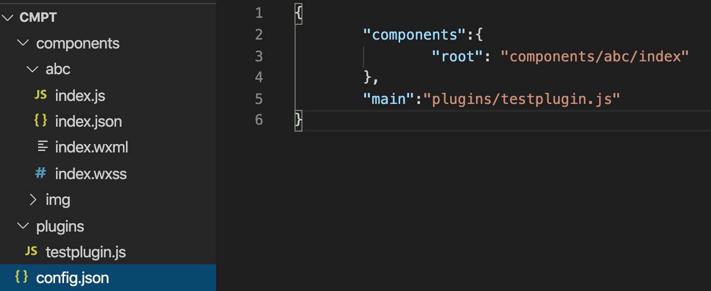
# 1. The config.json configuration file must exist in the directory
config.json
{
    "components":{
        "root": "components/demo/index"
    },
    "main":""
}
- The
componentsfield contains your custom components, and multiple components can be uploaded simultaneously. - The
mainfield exposes the plugin component for platform-side extensions. - There are no restrictions on the directory names or locations of your custom components and plugin files.
# 2. Creating a Simple Mini Program Component
demo/index.wxml:
<view class="container">
    <view>Mini Program Custom Component -- Lego</view>
</view>
demo/index.wxss:
.container{
  width: 300px;
  height: 100%;
  background:orange;
}
demo/index.js:
Component({
  methods:{
  },
  lifetimes:{
    attached() {
      console.log("attached")
    }
  }
});
demo/index.json:
{
  "component": true,
  "usingComponents": {}
}
# 3. Preparing for Upload
Compress the folder containing your component into a ZIP file for upload.
For example, directly compress the cmpt folder:
# Component Upload Guide
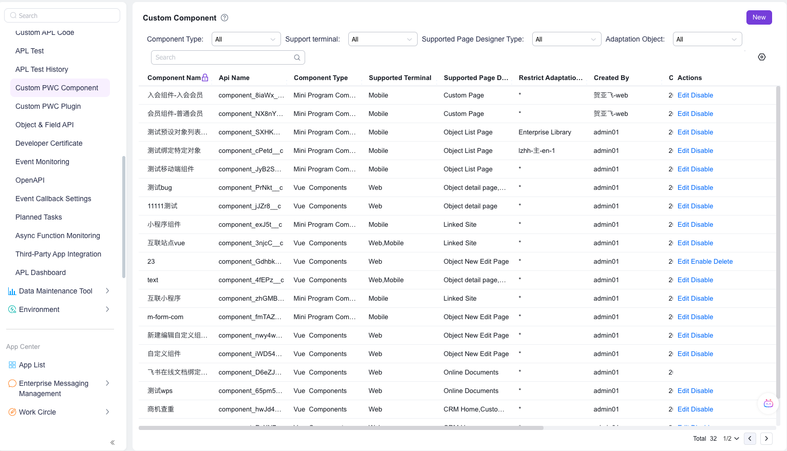
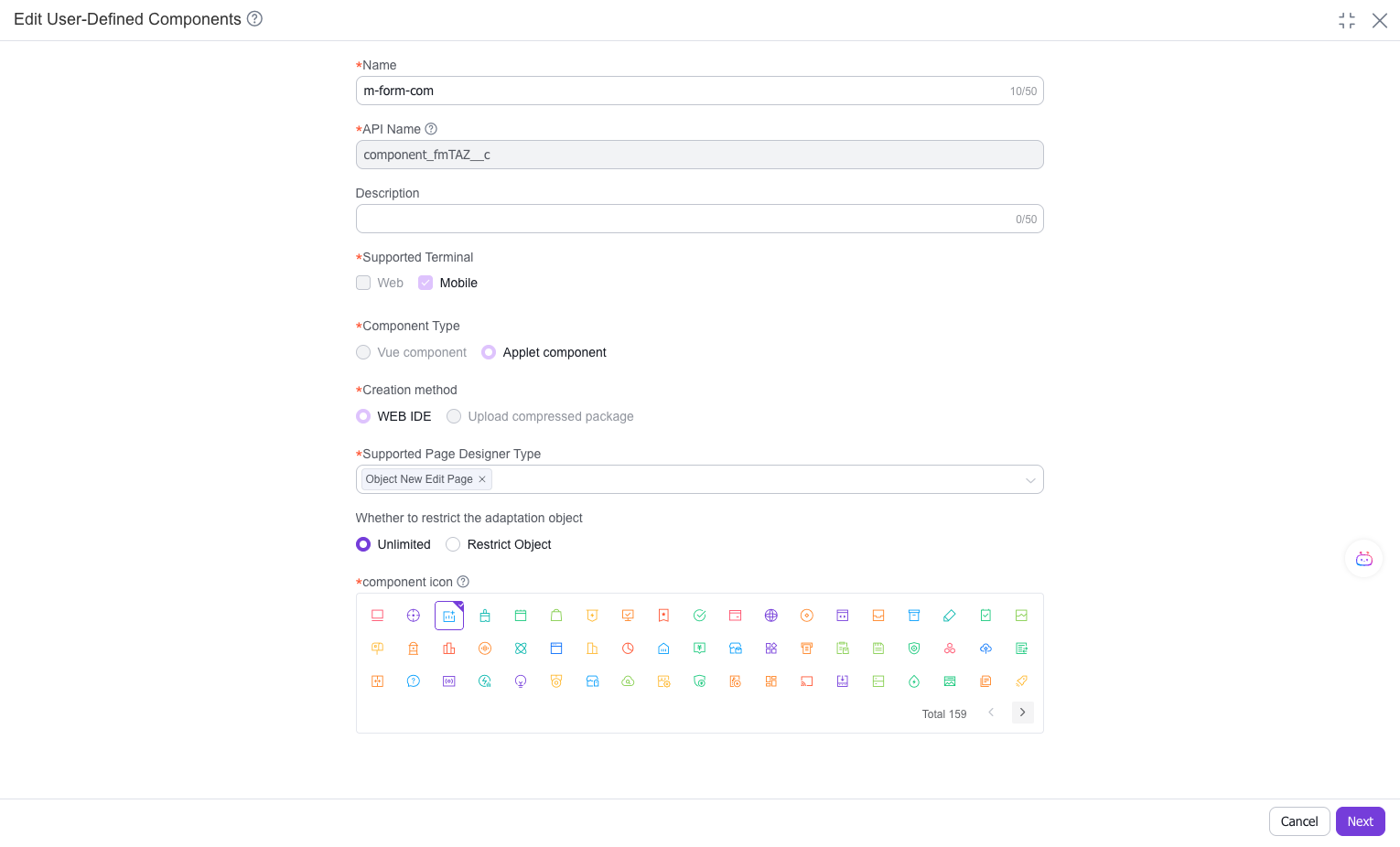
# Step 1: Navigate to the "Custom Components" management interface in the admin console, click "New," and upload the file
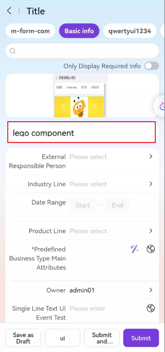
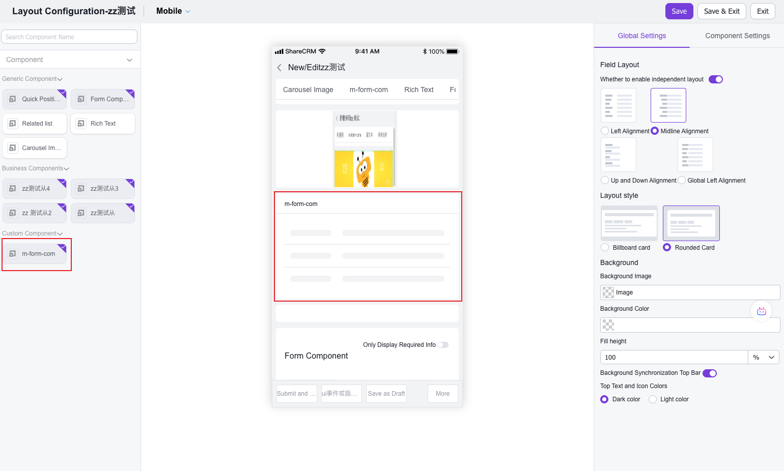
# Step 3: In the mobile layout designer, locate the "Custom Components" toolbox to see your component and drag it into the page layout
# Step 4: The frontend interface will display your "First Custom Component" after loading