Object Form Component
# Object Form Component
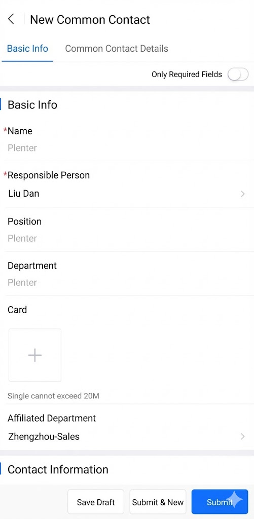
Used to display create/edit forms for business objects.
Preview:
# Component Reference Path avaComponent://objformpkgbase/pwc/objform/index
# Component Methods
| Method | Description | Parameter Type | Return Type |
|---|---|---|---|
| load | Trigger form loading and rendering | Object | void |
| validateDataThenGet | Return form data after validation | Object | Promise |
| triggerSubmit | Trigger standard form submission flow | Object | void |
# load Method Parameters
| Property | Description | Type | Options | Default |
|---|---|---|---|---|
| pluginApiName | Required, plugin apiName | String | — | — |
| objectApiName | Required, object apiName | String | — | — |
| action | Required, operation type | String | Add|Edit | Add |
| renderMode | Optional, rendering mode | String | standard (standard mode, UI identical to standard form page) embedded (embedded mode, suitable for forms with few fields and only main object, no title or bottom buttons) | standard |
| mainObjectData | Optional, pre-filled data for main object in create action, or data ID for edit action | Object | — | — |
| detailObjectDatas | Optional, pre-filled data for detail objects in create action | Object | — | — |
| KOtherUsefulDataForCreate | Optional, additional configuration parameters | Object | — | — |
| describeAndLayout | Optional, custom description and layout (consult R&D for structure definition) | Object | — | — |
| formPlugin | Optional, dynamic form plugin constructor | Function | — | — |
| useCustomTitleBar | Optional, use slot to extend custom title component | Boolean | — | false |
| useCustomBottomBar | Optional, use slot to extend custom bottom button component | Boolean | — | false |
# validateDataThenGet Method Parameters
| Property | Description | Type | Options | Default |
|---|---|---|---|---|
| validateRequired | Optional, whether to validate required fields (default true) | String | — | true |
| skipAllValidate | Optional, whether to skip validation and directly return data | String | — | false |
# triggerSubmit Method Parameters
None
# Basic Usage
com/index.wxml
<objform id="form" bind:attached="formAttached"/>
com/index.json
{
  "component": true,
  "usingComponents": {
    "objform": "avaComponent://objformpkgbase/pwc/objform/index"
  }
}
com/index.js
Component({
  methods:{
    /**
     * Trigger form loading after listening to objform component's attached event
     */
    formAttached(){
      // Get form component instance
      this.form = this.selectComponent("#form");
      // Trigger form component loading
      this.form.load({
        pluginApiName:"pwctest__c",
        objectApiName:"object_t6w1q__c",
        action:"Add"
      })
    }
  }
});
Preview:
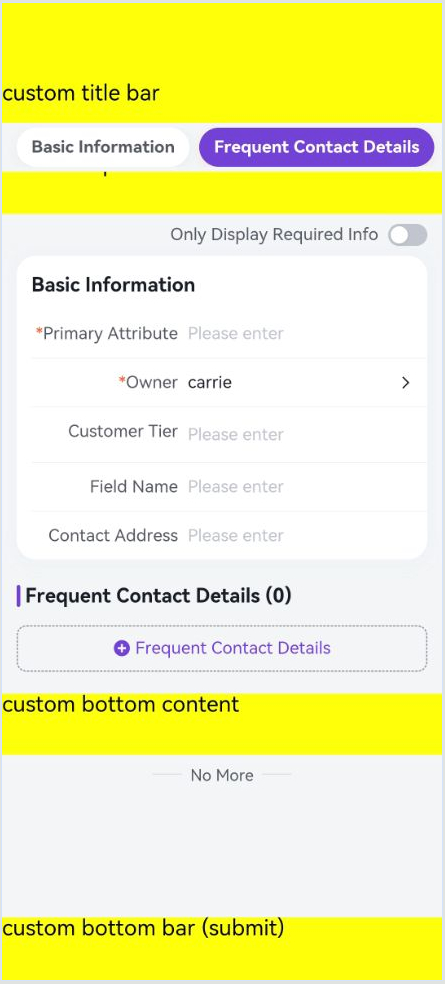
# Component Extensions
To meet enterprise customization requirements, we provide developers with several extension methods for rapid feature development.
# Component Slots
Component slots allow developers to insert components into predefined areas of objform.
titleBarandbottomBarslots are only supported whenrenderMode: standard
<objform id="form" bind:attached="formAttached">
        <view slot="titleBar" style="height:48px;padding-top: 50px;line-height: 48px;background:yellow;">Custom Title</view>
        <view slot="topContent" style="height:50px;background:yellow;">Custom Top Content</view>
        <view slot="bottomContent" style="height:50px;background:yellow;">Custom Bottom Content</view>
        <view slot="bottomBar" style="height:52px;padding-bottom: calc(env(safe-area-inset-bottom));background:yellow;position:fixed;z-index:12;left:0;right:0;bottom:0;" bind:tap="_submit">Custom Bottom Button【Submit】</view>
</objform>
Preview:
# Dynamic Plugins
Dynamic plugins allow developers to register plugins during form loading. Plugin capabilities are largely consistent with Object Form V2 plugins (refer to corresponding documentation).
com/index.js
Component({
  methods: {
    /**
     * Trigger form loading after listening to objform component's attached event
     */
    formAttached(){
      let self = this;
      this.form = this.selectComponent("#form");
      let myPlugin = {
        apply(){
          return [
            {
              event: 'form.render.end',
              target:'*',
              functional: self._formRenderEnd.bind(self)
            }
          ]
        }
      };
      this.form.load({
        pluginApiName:"pwctest__c",
        objectApiName:"object_t6w1q__c",
        action:"Add",
        formPlugin:()=>myPlugin
      })
    },
    _formRenderEnd(p,o){
      // Effect: Show toast after form rendering completes
      console.log("formRenderEnd",p,o)
      wx.showToast({title: 'Form rendering completed'})
    },
  }
});
# More Examples
# 1. Load standard create form with customized bottom buttons
Features:
- Trigger standard create action to load standard form
- Custom UI for bottom buttons
- Trigger standard submission flow when clicking custom submit button
- Dynamically inject plugin to listen for form loading completion event
Code:
com/index.wxml
<objform id="form" bind:attached="formAttached">
    <view slot="bottomBar" style="height:52px;padding-bottom: calc(env(safe-area-inset-bottom));background:yellow;position:fixed;z-index:12;left:0;right:0;bottom:0;" bind:tap="_submit">Custom Bottom Button【Submit】</view>
</objform>
com/index.json
{
  "component": true,
  "usingComponents": {
    "objform": "avaComponent://objformpkgbase/pwc/objform/index"
  }
}
com/index.js
Component({
  methods: {
    /**
     * Trigger form loading after listening to objform component's attached event
     */
    formAttached(){
      let self = this;
      this.form = this.selectComponent("#form");
      let myPlugin = {
        apply(){
          return [
            {
              event: 'form.render.end',
              target:'*',
              functional: self._formRenderEnd.bind(self)
            }
          ]
        }
      };
      this.form.load({
        pluginApiName:"pwctest__c",
        objectApiName:"object_t6w1q__c",
        action:"Add",
        mainObjectData:{
          name:"Test pre-filled main object data",
        },
        useCustomBottomBar:true, // Must set to true when using custom title bar component
        formPlugin:()=>myPlugin
      })
    },
    _formRenderEnd(p,o){
      console.log("formRenderEnd",p,o)
      wx.showToast({title: 'Form rendering completed', icon: 'none'})
    },
    _submit(){
      this.form&&this.form.triggerSubmit();
    },
  }
});
Preview:

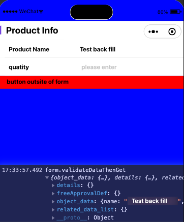
# 2. Embedded form component with on-demand data retrieval
Features:
- Load form using custom description and layout
- Retrieve form data when clicking external submit button
Code:
com/index.wxml
<view style="height:50vh;overflow: scroll;background:blue;padding-top: 50px;">
    <view>
        <objform id="form" bind:attached="formAttached"/>
        <view style="height:30px;background:red;" bind:tap="_myBtnClick">External Button</view>
    </view>
</view>
com/index.json
{
  "component": true,
  "usingComponents": {
    "objform": "avaComponent://objformpkgbase/pwc/objform/index"
  }
}
com/index.js
// Mock data
const describeAndLayout = {
  objectDescribe:{
    api_name: "object_t6w1q__c",
    fields: {
      name:{
        api_name:"name",
        type:"text",
        label:"Product Name",
      },
      num__c:{
        api_name:"num__c",
        type:"number",
        label:"Quantity",
      }
    }
  },
  layout:{
    components:[{
      api_name:"form_component",
      type:"form",
      field_section:[{
        api_name:"sect1",
        header:"Product Information",
        form_fields:[
          {
            field_name:"name"
          },
          {
            field_name:"num__c"
          }
        ]
      }]}]
  }
}
Component({
  methods: {
    /**
     * Trigger form loading after listening to objform component's attached event
     */
    formAttached(){
      let self = this;
      this.form = this.selectComponent("#form");
      this.form.load({
        pluginApiName:"pwctest__c",
        objectApiName:"object_t6w1q__c",
        renderMode: "embedded",
        describeAndLayout,
        mainObjectData:{
          name:"Test pre-filled main object data"
        }
      })
    },
    _myBtnClick(){
        this.form&&this.form.validateDataThenGet().then((rst)=>{
          console.log("form.validateDataThenGet",rst)
        }).catch((err)=>{
          console.log("form.validateDataThenGet err",err)
        });
    }
  }
});
Preview: